This is a poster for a Slipknot tour. It has an image of the band, which shows viewers what the poster is for. I like the use of color in this poster because the band is a metal band, dark colors suit the theme that the band set through their music.
I like this poster, because of the bright colors, they stand out from the black background. I think that the poster is cute and appealing. The many colors catch the eye of the viewer.
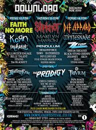
This poster is for the download festival, it has a variety of different bands playing Alternative music. I like the illustrations around the boarder of the poster, it makes the poster more interesting. It has a lot of text for information but it is an appealing for the type of people it is aimed at. The dark colors work well.


No comments:
Post a Comment