
Wednesday, 25 May 2011
I-D magazine cover
Tuesday, 24 May 2011
Overall Evaluation
We were asked to do a number of different things. Things related to music and fashion inspired by music. Like creating Cd covers & Posters. And we had to make stop motion videos too. And make blogs along with doing studio portraits.
The research that i have done throughout my work has helped to inspire all of my work. I have used some ideas and effects to enhance the quality of my own work.
I took my own photos for all of my tasks. I think that they turned out quite well too.
I used the studio camera, photography cameras and even my own phone camera to complete my work.
Using the studio camera was the highest quality, while using my phone camera was the worst.
If i were to do these projects again i would make them more professional and do more research. I am happy with how they turned out and i am happy with my overall work.
Blog Evaluation
we were asked to create blogs to store our work on to be graded, and to update them with work and research regularly. We did studio portraits where we worked with others in the studio.
I researched some different styles and effects for camera use. These helped influence effects that were used in the studio portraits. I wanted them to be creative.
We used different backlighting to change the colors behind the models. I think that that effect worked well.
I think that we achieved what w had wanted to, Both in studio portraits and Blogs. I was able to successfully post my research and work onto the blog. And the portraits turned out quite well.
If I were to do this again i wold probably put much more research on my blog and maybe try more different effects in the studio.
Stop Motion Evaluation
We were asked to create a stop motion video using photos that we had taken. We also had to research existing stop motion videos and make a test video too.
The research i did helped me understand how to make a stop motion video work. I looked at existing stop motion videos such as 'T-Shirt war' It was very creative. It showed me how creative stop motion video making can be.
I took my own photos for my stop motion videos, i took them using the camera on my phone.
I experimented with using different toys, such as plastic boats and Lego. I think that those ideas turned out quite well.
If i were to make my stop motion videos again, i would definitely use a better quality camera. I would use a camera stand too so i could keep the camera in one place while taking the photos, I think that the movement of the camera in my videos kind of ruined them. I might even get people involved in the next one.
Stop motion Video
This is my stop motion video. The video is of a lego ninja, using a katana, fighting a lego dragon. The picture quality isn't very good because i had to take the pictures using my phone. But this is my finished stop motion video. The music is Cops'n Robbers by Sagisu Shiro. I Made the opening and ending images on photoshop. I like the way that this turned out but it could have been a lot better.
Monday, 23 May 2011
Photography Evaluation
We were asked to Create a Poster/Flyer and a Cd cover using photography. We also had research to do.
The research i did helped to influence the way i made my posters and Cd cover. I was doing my poster for a katy perry tour and my Cd cover for a band of my making. I researched the style of katy perry and came up with some initial designs and ideas.
I took my own photos to use on both the poster and Cd cover.
I wanted to use a dull background for the poster to make the cartoons stand out more. And for the Cd cover i wanted to make it black and white with a goth-like theme.
I think that using the graveyard on the Cd cover was a good idea to set the kind of mood i was aiming for. And i think that using the bright colors that i did for the poster was a good idea because those kind of colors usually portray katy perry. The drawing that i did and edited did not work too well so i didn't use it.
If i were to make these again i would make them more professional and try to get a model involved next time. I think that i achieved most of what i wanted to do in this section of my work.
Blog intro
we have been creating and updating these blogs with all of our work for photography. We show all of our work and research on here.
Wednesday, 18 May 2011
Stop Motion Research
This is a stop motion video, it is called t-shirt wars. where two men have a war using t-shirts and stop motion to create great effects. I like this video and think is is a great use of stop motion. It is also very creative. I want my stop motion video to be creative too and maybe i can use some ideas from this video to influence my video.
Test Stop Motion Video
This is my test stop motion video. I think that this is ok for a test video. I took some plastic boats and arranged them in different ways. I took the photos using my mobile phone camera.
Tuesday, 17 May 2011
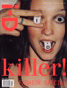
Studio wink work


We worked in the studio taking i-D wink images. We then edited them to turn them into magazine covers. The one on the left is the original design and the one on the right is the one i made black and white. I think that that one looks good but i think i prefer the original color design. I edited the images using photoshop.
Model: Supa
Monday, 16 May 2011
Cd cover design

Cd cover Packaging research

This is typical Cd Packaging. A plastic box where the Cd is located in the middle held in by plastic. The cover image is inserted in the clear plastic . This is a very common way to box a Cd. The back image goes into the plastic part of the back of the box. The box keeps the Cd itself safe from damage and is a good. This is typical Cd Packaging. A plastic box where the Cd is located in the middle held in by plastic. The cover image is inserted in the clear plastic front. This is a very common way to box a Cd. The back image goes into the plastic part of the back of the box. method of Cd packaging.

This Cd packaging is a bit more different. Its more creative than the usual plastic box. But its true that this design wouldn't really protect the Cd well from damage as it has holes where the disc shows. This is a simple template design of cardboard.

This is the same kind of template cardboard design as the packaging above, except the Disc has more protection and there are more graphics on the outside. The added images make it more appealing.

This is a creative Disc Case. It is inside a plastic case shaped like a donut. I think that is clever as it relates to the Cd content. Being shaped like a donut, the case comes in a box that has the shape of a cake box. This is strange packaging and is entertaining.

This Cd case is made of cardboard and takes a strange box shape. It looks creative and different. The design itself though is rather simple but still effective.
Wednesday, 6 April 2011
Fashion - Goth


Fashion - Punk

Fashion - J Pop


Wednesday, 23 March 2011
Wink

 The 'Wink' of i-D is a technique used on every cover of i-D magazine.
 These are a few covers of i-D magazine. Most of them are winking, but on some covers they don't wink but cover one eye.


I-D Magazine
I-D is a british magazine dedicated to Fashion, Music, Art and Youth culture. Founded by Terry Jones (Vogue art director) in 1980. Known for innovative Photography and Typography. I-D uses the individuality of people to show fashion trends inspired by a number of different things. Eg. Music, Art.
We have been asked to design shoot pages for this summers issue of I-D The issue title is 'Fusion', We will have four sections of the magazine to complete.
*We Have to produce five straight-up portraits with interview questions and answers.
*Choose a combination of music genres Eg. Rock, Punk, Indie. And research the origin and characteristics of each of them. ( The roots and influences, together with fashion/Style associated with them.
*Photograph and interview someone from the music industry Eg. Singer, Song Writer, Band member, Roadie, Sound Engineer.
*And to produce a new front-cover for I-D magazine. Including the I-D 'wink'. The final layout should also include the I-D logo and feature titles.
Wednesday, 9 February 2011
Other Logo Image


Another way ive been considering to do my Album cover is using dark imagery edits. I took the top left image of me, and i used the threshold effect in photoshop to change the image. I like the way it turned out, so ive been considering using it for my album cover.
Colored CD Image

Wednesday, 2 February 2011
Cd Image

This is the image i have designed to go over the photograph background. I drew this picture to be Katy Perry. And i think this picture would sit it well when color is added. I will be editing this picture on photoshop and hopefully using a graphics pad. But this is the initial design of the CD image.
T

This is one of the old album me and Ben designed using random searches on wikipedia and wikiquote. I like how this one had turned out because of the editing on photoshop. We made it black & white effect then added some of the color back to the dolls dress.
Wednesday, 26 January 2011
Pictures for Cd Cover


For this picture i looked up to an old post and caught some of the branches in the picture too. I think that is a good effect and looks quite dreary, i would like to edit it to make it in black and white if i were to use it for a Cd Cover.

 For the image to the right. I took an average picture of a piece of the monument outside of the college. I think it has some good effect to it But it is quite dull and boring in creativity. I wouldn't use it for a CD Cover but i was experimenting different possibilities.
Cd Cover

We were given a piece of paper with a name for an album on it, and we were told to go out and take pictures that were relevant to use to design a Cd Cover using that title. We thought it would be appropriate to take pictures in the town centre on the streets and down the alleyways. We took several pictures but i thought it was best to use this one. I edited the image on photoshop and used the threshold effect to add this black and white shadowed effect to the image, i like the way the bricks look using this effect. I then added the title and artist of the album. I think that this turned out well and i am pleased with how it looks.
Music Poster Design

This is the Music Poster i designed, I used a technique of adding illustrations on top of a photograph. I went out and took a picture of an old church tower, then i used photoshop to make it black and white. I then drew in the images using illustrator. I tried to make them look cute and colorful to go with the title i chose, Cartoon Motion, so i made the images and text on top look cartoonish. I like the way this turned out. I looks cute and unique the way i wanted it, but the images could be a lot better.
Wednesday, 12 January 2011
Existing Music Posters

This is a poster for a Slipknot tour. It has an image of the band, which shows viewers what the poster is for. I like the use of color in this poster because the band is a metal band, dark colors suit the theme that the band set through their music.

I like this poster, because of the bright colors, they stand out from the black background. I think that the poster is cute and appealing. The many colors catch the eye of the viewer.

This poster is for the download festival, it has a variety of different bands playing Alternative music. I like the illustrations around the boarder of the poster, it makes the poster more interesting. It has a lot of text for information but it is an appealing for the type of people it is aimed at. The dark colors work well.
Other Album covers

Other album covers

Existing Katy Perry album covers

Perry album if we do. The color scheme suits the type of music she produces and that works well. These examples will help inspire our Cd cover a lot through designing.

Intro to Cd cover
We are going to design a CD cover for our band. And we are also designing a music poster using photographs we have taken. I think we should make ours unique and creative. They must also be appealing and relevant to the style of music audience that they are aimed at. Our CD cover is for a Katy Perry album. So i think bright colors would be appropriate for the album cover.
Music Poster

Subscribe to:
Comments (Atom)