Wednesday, 23 March 2011

Wink

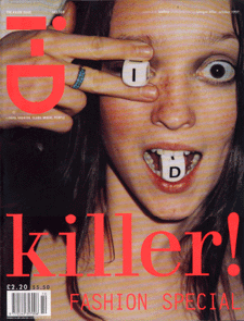
 The 'Wink' of i-D is a technique used on every cover of i-D magazine.

These are a few covers of i-D magazine. Most of them are winking, but on some covers they don't wink but cover one eye.


I-D Magazine

I-D is a british magazine dedicated to Fashion, Music, Art and Youth culture. Founded by Terry Jones (Vogue art director) in 1980. Known for innovative Photography and Typography. I-D uses the individuality of people to show fashion trends inspired by a number of different things. Eg. Music, Art.

We have been asked to design shoot pages for this summers issue of I-D The issue title is 'Fusion', We will have four sections of the magazine to complete.
*We Have to produce five straight-up portraits with interview questions and answers.
*Choose a combination of music genres Eg. Rock, Punk, Indie. And research the origin and characteristics of each of them. ( The roots and influences, together with fashion/Style associated with them.
*Photograph and interview someone from the music industry Eg. Singer, Song Writer, Band member, Roadie, Sound Engineer.
*And to produce a new front-cover for I-D magazine. Including the I-D 'wink'. The final layout should also include the I-D logo and feature titles.

Wednesday, 9 February 2011

Other Logo Image


Another way ive been considering to do my Album cover is using dark imagery edits. I took the top left image of me, and i used the threshold effect in photoshop to change the image. I like the way it turned out, so ive been considering using it for my album cover. 

Colored CD Image

This is the final colored version of my CD image. I used photoshop and a graphics pad to color in the image. I think it turned out well. I might be using this for the main image on the CD.

Wednesday, 2 February 2011

Cd Image

This is the image i have designed to go over the photograph background. I drew this picture to be Katy Perry. And i think this picture would sit it well when color is added. I will be editing this picture on photoshop and hopefully using a graphics pad. But this is the initial design of the CD image.

T

This is one of the old album me and Ben designed using random searches on wikipedia and wikiquote. I like how this one had turned out because of the editing on photoshop. We made it black & white effect then added some of the color back to the dolls dress. 

Wednesday, 26 January 2011

Pictures for Cd Cover

I took this picture of some pigeons perched on the backrest of a bench. I like the way that the perched pigeons stand out from the rest of the pigeons. I think with some editing this picture  could look really good for a Cd Cover.


For this picture i looked up to an old post and caught some of the branches in the picture too. I think that is a good effect and looks quite dreary, i would like to edit it to make it in black and white if i were to use it for a Cd Cover.

I managed to get a shot of the pigeons flying overhead, i like this shot because it has motion in it. I think it would be a good Cd cover because the motion in a piture adds more to it, and flying birds can symbolise freedom, i think that that would be effective in a Cd Cover image.


For the image to the right. I took an average picture of a piece of the monument outside of the college. I think it has some good effect to it But it is quite dull and boring in creativity. I wouldn't use it for a CD Cover but i was experimenting different possibilities.